exp-sd.com
exp-sd.com is for experimental tests I make to do with new technologies or ideas we're planning for future work. These test will not be the finished article but they demonstrate what can happen with various software or coding.
Web
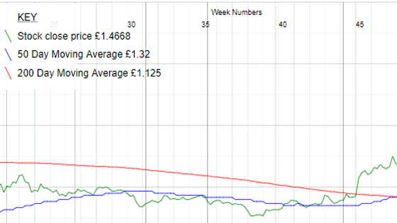
Stock Price Graph
The graph package from 2016 is modified slightly in terms of how it goes through the data. For the case where there is no data collected at weekends, I re-wrote the script so that it is still able to divide the weeks up, and it knows where the new month/year is even if it falls on a weekend. The... click for more
02 Jan 2021
26 Dec 2021

RSVP Reader
This was a fun project one weekend in 2019. The user can select a book from the dropdown and press play. The book that they have chosen gets delivered to them one word at a time. The user can modify the words per minute, pause and stop. It should also be possible to enter the exact word you want... click for more
15 Mar 2020
03 Jan 2021
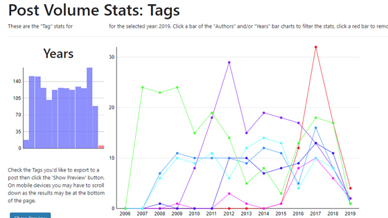
Post Volume Stats
An update to the WordPress plugin is that it now has a name and is in its third year of existence. Post Volume Stats has gradually been developed in my spare time with feedback from other helpful people who have used the plugin themselves.click for more
28 Jan 2019
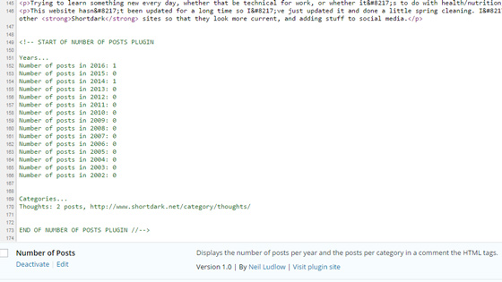
WordPress Plugin: Number of Posts
My first attempt at a WordPress Plugin using the WordPress Plugin API. This simple plugin basically counts the posts and writes them into a comment. Hopefully more to come... possibly even something normal viewers of the blog may be able to see.
Will try to keep up-to-date on
03 Jul 2016
03 Jan 2021
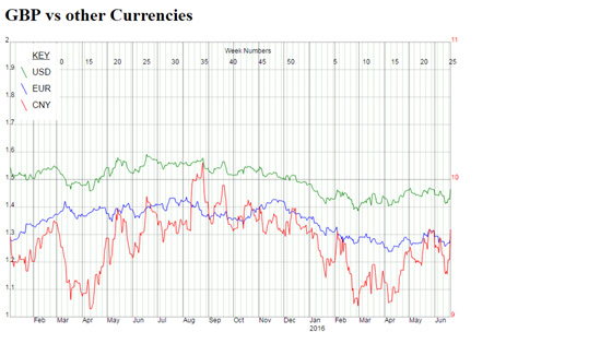
JSON into a SVG
This test grabs currency vs currency data from a JSON API and plots it in graph. Seeing as the data from a particular date isn't going to change in the future there's only one API call per data point. USD and EUR use the left-hand axis and CNY uses the axis on the right. Because Friday, Saturday... click for more
22 Jun 2016
03 Jan 2021
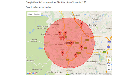
Finding Nearby Places from an Address
This is similar to what you might find on a dating website where you enter your address and it finds nearby matches for you. This was a quick test that uses a Google API to get the longitude and latitude, then we work out the distances from there. Finally, the results are presented on a Google... click for more
08 Jun 2016
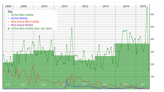
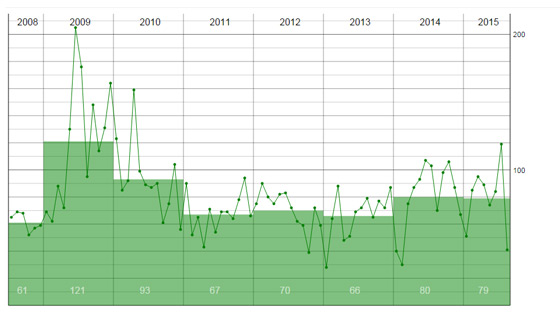
Multi-query MySQL Database SVG Graph
The same code from here was extended to make it possible to have up to 2 constraints. The two constraints here are (active/non-active) and (mobile/non-mobile). The main graph, which has the average bar chart behind it,... click for more
07 Aug 2015

Dynamic Pie Chart SVG
This used all my powers of trigonometry and takes the same data as used in the world map example to make a pie chart. Small and large angles are dealt with by the code. The main mistake here is that secondary countries and tertiary countries are all treated the same as the primary country so the... click for more
07 Aug 2015
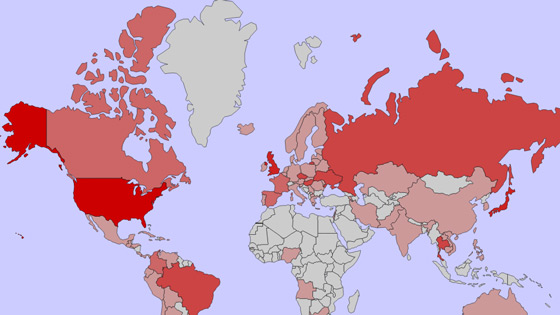
Volume data displayed on World Map
Data from various different countries is collated with PHP and an SVG world map image is altered to show the volumes present in each country. This particular map did not match up 100% with the data I have (there is no Hong Kong or Hawaii). The countries that are highlighted all have data... click for more
07 Aug 2015
Database to XML to quick-loading SVG Graph
This code is derived from some code I posted on Github in Feb 2014 making a SVG graph from a database. The code is updated and instead of counting all the rows every time the graph is loaded I added an extra stage to take the... click for more
07 Aug 2015